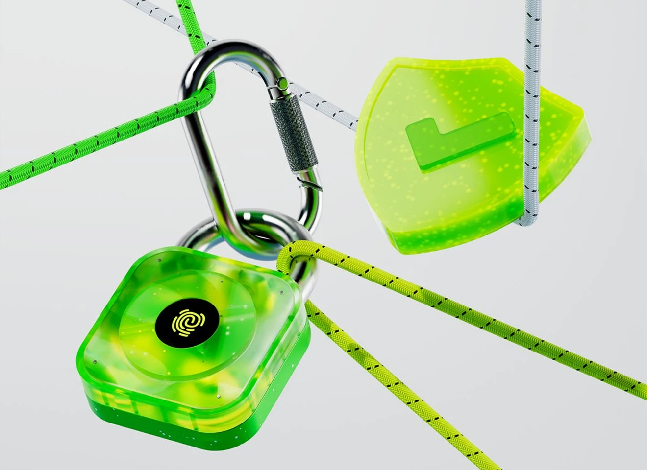
The 2026 Design System Playbook: Bridging the Void Between Figma and Production Code
Most corporate design systems die in Figma files that never match production realities. Discover how to architect unified design tokens, component APIs, and automated handoffs that engineers respect.


Companies invest millions crafting sprawling Figma component libraries, only to discover that months later, the shipped production application looks like an approximate counterfeit of the original designs. Spacing drifts, inconsistent border radiuses proliferate, and engineers end up hacking ad-hoc utility classes into templates. Closing this gap requires shifting from visual decoration to systemic engineering tokens.
The Great Designer/Developer Disconnect
The traditional handoff model is inherently lossy. A designer exports static redlines, and an engineer interprets them through their own stylistic lens.
When design systems fail, it is almost never because the components were visually deficient—it is because the taxonomy of naming conventions in Figma did not map 1:1 with CSS variables and Tailwind utility configurations.
"A design system is not a Figma file. A design system is a shared language codified in both design variables and production code."
Token-First Architecture: Colors, Spacing & Motion
We structure all design tokens into three immutable layers: Global/Primitive tokens, Semantic/Intent tokens, and Component-scoped tokens.
By tying semantic variables (like --surface-glass or --color-terracotta) directly into tailwind.config.ts, changing a brand theme or dark mode rule requires updating a single config file rather than touching hundreds of isolated markup components.
Designing Component APIs That Developers Love
Components should be designed with strict variant props, predictable slots, and native keyboard accessibility built into their base definition.
Avoid creating monolithic components that attempt to handle 30 distinct edge cases. Favor composable atoms and molecular primitives that engineers can snap together like Lego blocks.
Maintaining the Single Source of Truth
Use automated token synchronization tools (like Style Dictionary or Tokens Studio) to push changes directly from Figma commits into Git pull requests. When design updates trigger automated staging previews, developer-designer friction evaporates.
Summary & Next Steps
Transform your digital product workflow from an adversarial handoff into a unified, high-speed release engine. At Web Makar, our design systems are built for production execution from day one.
Focusing on sub-second web architecture, design token ergonomics, and conversion engineering for venture-backed teams and ambitious creative agencies.